04 — Logo System

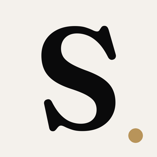
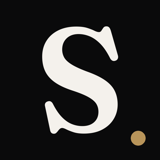
 Monogram

 Lockups
Single-color variants
Lockups
Single-color variants

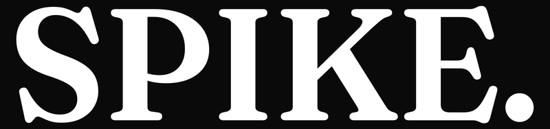
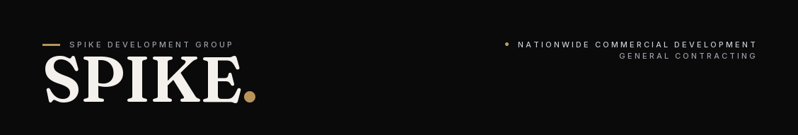
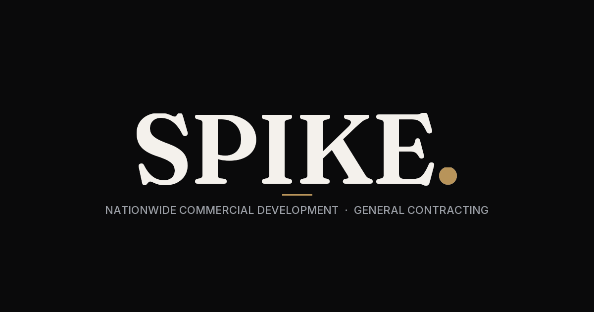
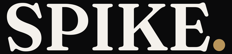
Wordmark, monogram, lockups.
The primary mark is "SPIKE." set in Fraunces SemiBold with a Signature Gold period — the single accent. The monogram is a square Obsidian "S" with the gold dot echoed in the lower-right corner. The wordmark and monogram are used independently — never side-by-side. The wordmark carries the name in lockups and chrome; the monogram serves as a standalone stamp for icons, avatars, and badges. Reverse variants exist for every form; the brand is built dark-first.
Primary wordmarkPrimary · Obsidian on Bone
Reverse · Bone on Obsidian
Bone
Obsidian
Transparent
On Gold (rare)
Horizontal · Primary
Horizontal · Reverse
Stacked · Primary
Stacked · Reverse
100% Black
100% White (KO)
Full color · default